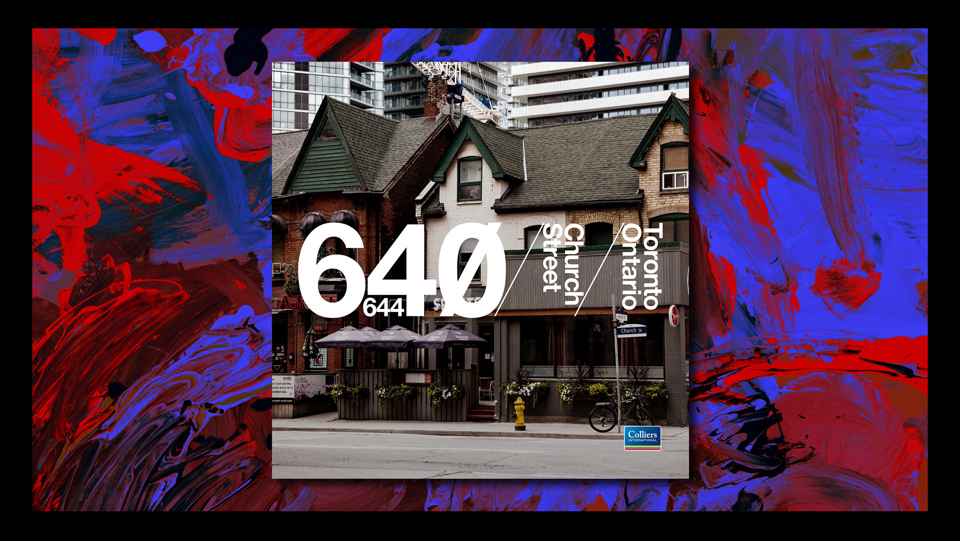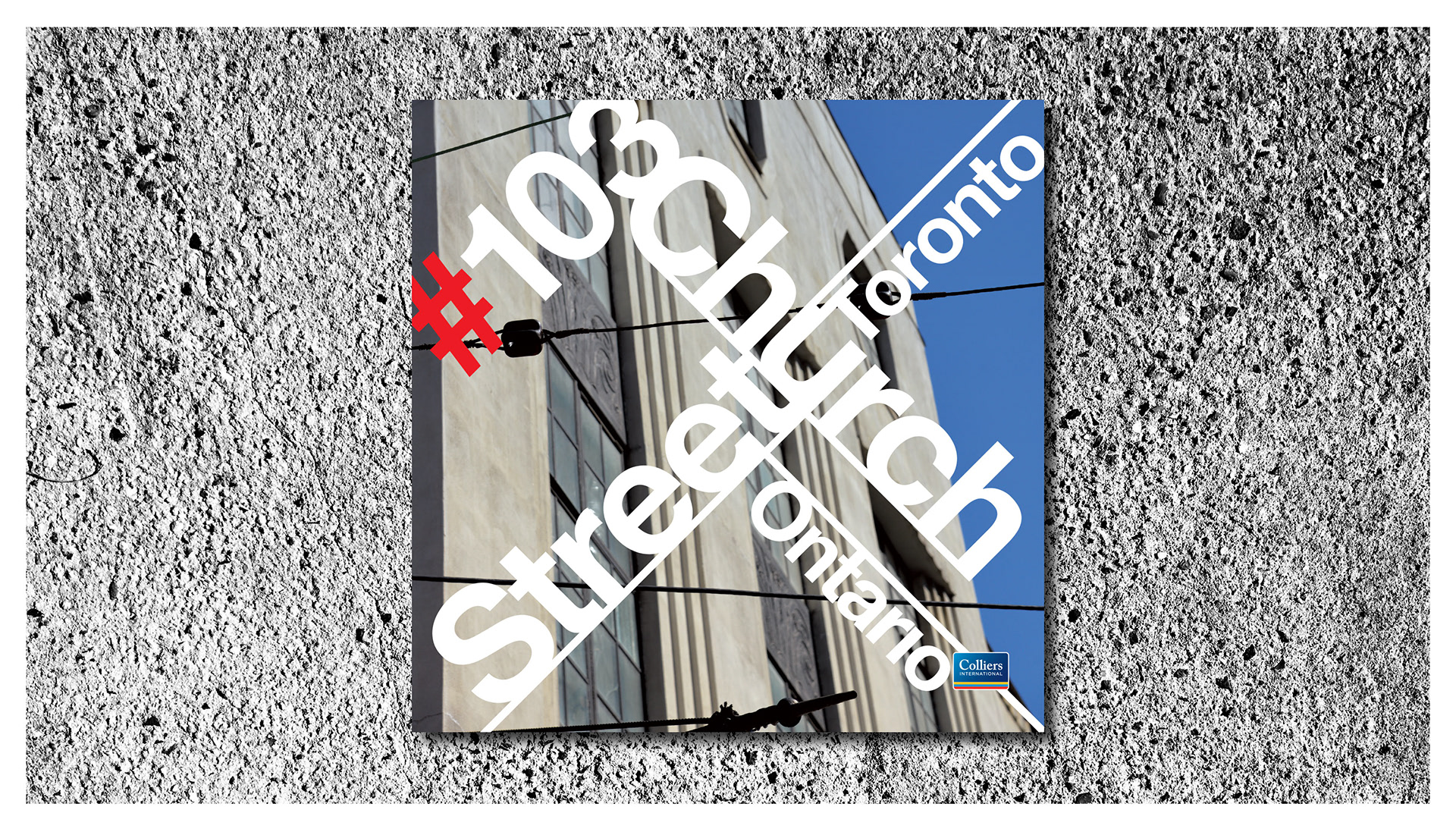
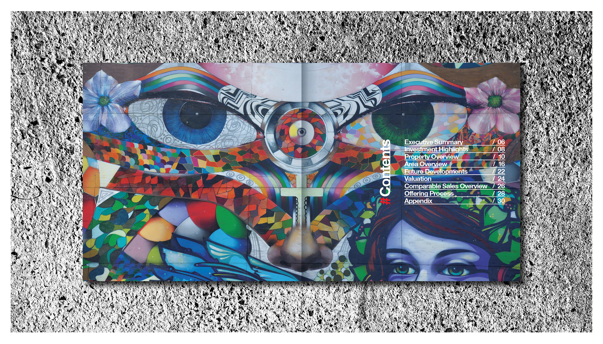


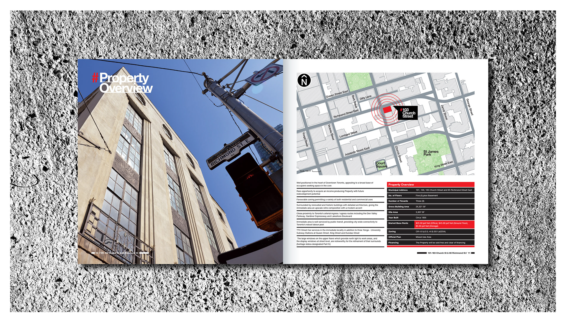
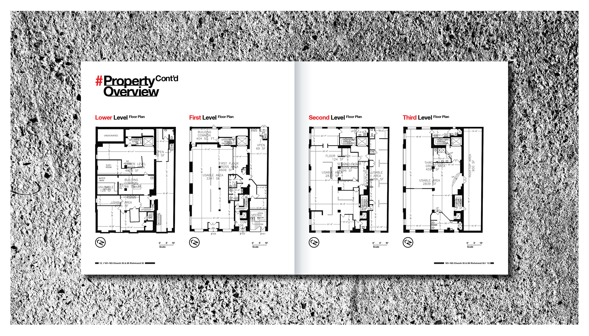
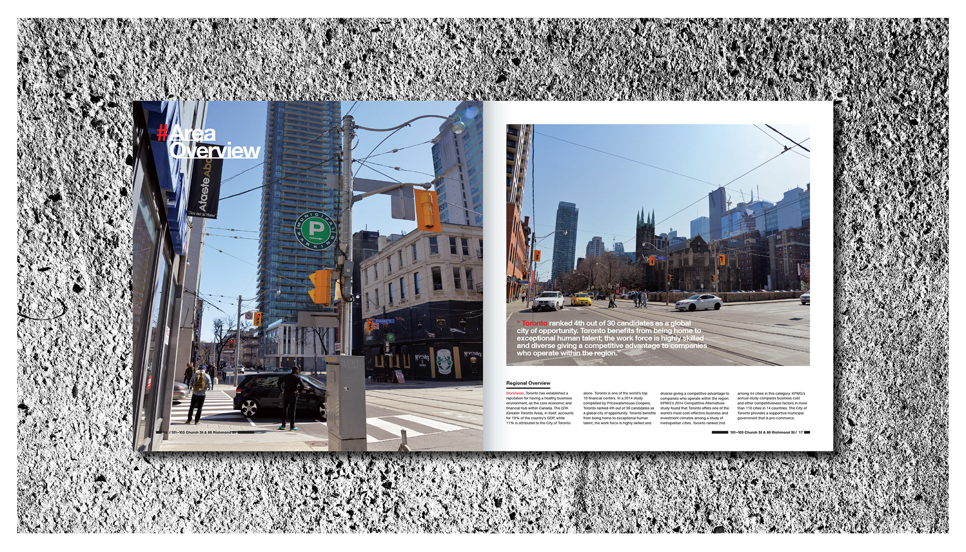

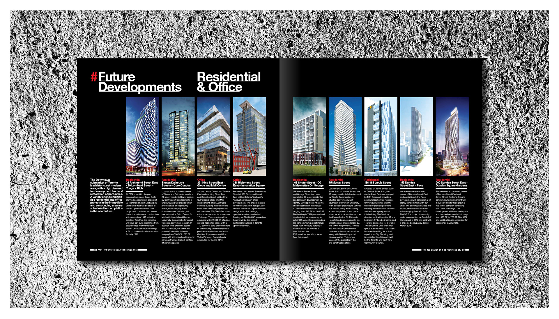
The agents brief was, “make it dynamic and simple”. With this in mind an angled type treatment with a simple colour breakdown of black and red was devised. Small amounts of red is used to highlight section starters, along with balancing out spreads. Photography was taken by me with dynamic in mind. Trying to get the best angles possible of such a small but lovely piece of 1930’s architecture, a highly simple grid system, that’s both mouldable for information and structured enough for consistency was also created.